Build a Modal Dialog with JavaScript
You have definitely seen a modal before. You clicked a button on a website, and a small window appeared on top of the page. Everything behind it went dark.…

Key topics
You have definitely seen a modal before. You clicked a button on a website, and a small window appeared on top of the page. Everything behind it went dark. You could not click anything else until you dealt with that window—either by confirming an action, entering your email, or finding the little X button to close it.
That pop-up is called a modal dialog, and it is one of the most common UI patterns on the web. Confirmation prompts, sign-up forms, settings panels, cookie notices—all of these are often built as modals.
Here is the part that surprises most beginners: a modal is not one thing. It is three layers working together—the page behind, a dimmed overlay, and the dialog box in front—held together by a single idea. That idea is a visible/invisible state that you control with JavaScript.
In this JavaScript modal tutorial, you will build that state machine by hand. No libraries, no frameworks, no magic. Just HTML, CSS, and plain JavaScript.
What a Modal Actually Is
Before we write any code, let us get the mental model right.
A modal is a dialog box that sits on top of the page and blocks interaction with everything behind it. When a modal is open, you cannot click the buttons underneath it. You cannot scroll the page behind it. The modal demands your attention until you close it.
That last part is what makes a modal different from a regular pop-up. A modal is modal—it creates a mode where the dialog is the only thing you can interact with.
To build one, you need three visual layers:
- The page behind—your normal content, still there but temporarily blocked.
- The overlay—a semi-transparent layer that covers the whole screen and dims the page.
- The dialog box—the small window in front with your content and close button.
Now, you might be thinking: "Can't I just hide a div and show it when I click a button?" Yes, you can. But that is not a modal. That is just a hidden box appearing on the page. The overlay is what makes it a modal. The overlay is what blocks the page behind and forces the user to focus on the dialog.
You might also be thinking of the browser's built-in alert() function. That is a modal of sorts—it blocks the page and demands attention. But it is ugly, you cannot style it, and it only shows plain text with an OK button. Real products need something better. That is why developers build custom modals.
In real products, modals appear everywhere:
- Confirming a destructive action like deleting an account
- Collecting an email address for a newsletter
- Showing a settings dialog without navigating away
- Displaying a photo or video in a lightbox
The core idea behind all of them is the same: a visible/invisible state that JavaScript flips.
Knowledge check
Check your understanding
Answer this question before you continue.
What We're Building and How It Behaves
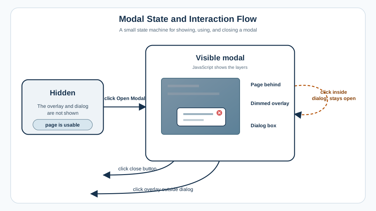
Here is the project goal: you will build a modal dialog that opens when you click a button, and closes when you click the X button inside it or click the dimmed overlay behind it.
Here is what the finished component looks like in action:
- The page loads with a button labeled "Open Modal."
- You click the button.
- The overlay fades in, dimming the page.
- The dialog box appears in the center with a heading, some text, and an X button.
- You close it by clicking the X button or by clicking the dark overlay outside the dialog.
- The overlay and dialog disappear, and the page is interactive again.
Every one of those open and close actions is an explicit state change driven by JavaScript. That is the learning goal of this project. You are not just making something appear and disappear. You are building a small state machine where JavaScript decides when the modal is visible and when it is hidden.
You will need three files:
project-folder/
├── index.html
├── style.css
└── script.js
No libraries. No build tools. Just three plain files that any browser can run.
Setting Up the HTML Structure
Let us start with the skeleton. Open your code editor, create a folder called modal-project, and inside it create a file named index.html.
Here is the full HTML structure:
<!DOCTYPE html>
<html lang="en">
<head>
<meta charset="UTF-8">
<meta name="viewport" content="width=device-width, initial-scale=1.0">
<title>Modal Dialog Project</title>
<link rel="stylesheet" href="style.css">
</head>
<body>
<h1>My Page</h1>
<p>This is some content on the page behind the modal.</p>
<button class="open-modal-btn">Open Modal</button>
<div class="modal-overlay hidden">
<div class="modal-box">
<button class="close-modal-btn">×</button>
<h2>Hello There!</h2>
<p>This modal was built with plain HTML, CSS, and JavaScript.</p>
</div>
</div>
<script src="script.js"></script>
</body>
</html>
Let us walk through each piece.
The <button class="open-modal-btn"> is your trigger. When clicked, it will tell JavaScript to show the modal.
The <div class="modal-overlay hidden"> is the overlay. It has two jobs: dim the page behind the dialog and block clicks on the content underneath. Notice it has the class hidden. That class will keep it invisible until JavaScript removes it.
Inside the overlay sits the <div class="modal-box">. This is the dialog box itself—the small window with your content. It contains a heading, a paragraph, and a close button.
The close button uses ×, which is the HTML entity for the multiplication sign (×). That is the standard way to render an X icon without needing an image or icon font.
The hidden class on the overlay is important. Right now, the overlay and everything inside it is invisible. Your JavaScript will remove that class to show the modal, and add it back to hide it.
Styling the Modal with CSS
Now let us make this look like an actual modal. Create a file named style.css in the same folder.
* {
  margin: 0;
  padding: 0;
  box-sizing: border-box;
}

body {
  font-family: Arial, sans-serif;
  padding: 40px;
  line-height: 1.6;
}

.open-modal-btn {
  padding: 12px 24px;
  font-size: 16px;
  background-color: #4a6cf7;
  color: white;
  border: none;
  border-radius: 6px;
  cursor: pointer;
  margin-top: 20px;
}

.modal-overlay {
  position: fixed;
  top: 0;
  left: 0;
  width: 100%;
  height: 100%;
  background-color: rgba(0, 0, 0, 0.5);
  display: flex;
  justify-content: center;
  align-items: center;
  z-index: 1000;
}

.modal-box {
  background-color: white;
  padding: 30px;
  border-radius: 8px;
  max-width: 400px;
  width: 90%;
  position: relative;
  box-shadow: 0 10px 30px rgba(0, 0, 0, 0.2);
}

.close-modal-btn {
  position: absolute;
  top: 10px;
  right: 15px;
  font-size: 24px;
  background: none;
  border: none;
  cursor: pointer;
  color: #888;
}

.close-modal-btn:hover {
  color: #333;
}

.hidden {
  display: none;
}
The key parts here are the position: fixed on the overlay and the hidden class at the bottom.
position: fixed pins the overlay to the viewport. No matter how far the user scrolls, the overlay always covers the entire visible screen. The top: 0, left: 0, width: 100%, and height: 100% values stretch it across the whole viewport.
The background-color: rgba(0, 0, 0, 0.5) gives the overlay a semi-transparent dark background. That is the dimming effect you see on real websites.
display: flex with justify-content: center and align-items: center centers the dialog box both horizontally and vertically. This is the simplest way to center a modal on the screen.
The z-index: 1000 makes sure the overlay sits above all other page content. If your page has other positioned elements, a high z-index guarantees the modal wins the stacking battle.
Now the important part: the .hidden class. It sets display: none, which completely removes the overlay from the page. No space is taken up, no clicks can land on it, and nothing inside it is visible.
This hidden class is the single switch that your JavaScript will flip. Remove it, and the modal appears. Add it back, and the modal disappears.
Opening the Modal with JavaScript
Now for the fun part. Create a file named script.js in the same folder.
First, you need to select the elements you will be working with. JavaScript gives you a tool called querySelector that finds elements by their CSS selector:
const openModalBtn = document.querySelector('.open-modal-btn');
const modalOverlay = document.querySelector('.modal-overlay');
const closeModalBtn = document.querySelector('.close-modal-btn');
Each line here grabs one element from the page. The first line finds the button with the class open-modal-btn. The second finds the overlay. The third finds the close button inside the dialog.
Now let us write the function that opens the modal:
function openModal() {
  modalOverlay.classList.remove('hidden');
}
That is it. One line. The classList property gives you methods to work with an element's classes, and remove('hidden') takes the hidden class off the overlay. When that class disappears, the CSS rule .hidden { display: none; } stops applying, and the overlay becomes visible.
But a function does nothing until something calls it. You need to attach it to the button so it runs when the button is clicked:
openModalBtn.addEventListener('click', openModal);
The addEventListener method tells the browser: "When this button is clicked, run this function." The first argument is the event type ('click'), and the second is the function to run.
Here is the complete script so far:
const openModalBtn = document.querySelector('.open-modal-btn');
const modalOverlay = document.querySelector('.modal-overlay');
const closeModalBtn = document.querySelector('.close-modal-btn');

function openModal() {
  modalOverlay.classList.remove('hidden');
}

openModalBtn.addEventListener('click', openModal);
Save the file and open index.html in your browser. Click the "Open Modal" button.
The overlay should appear, dimming the page, with the dialog box centered on top.
This is your first explicit state change. The modal was hidden. You clicked a button. JavaScript removed the hidden class. The modal became visible. You controlled that transition with code.
Knowledge check
Check your understanding
Answer this question before you continue.
Closing the Modal with the Close Button
Opening is only half the story. A modal that never closes would trap your users. Let us build the mirror operation.
The close function does the opposite of the open function. Instead of removing the hidden class, it adds it back:
function closeModal() {
  modalOverlay.classList.add('hidden');
}
When the hidden class is added back, the CSS rule kicks in again, and the overlay disappears from the page.
Now attach this function to the close button:
closeModalBtn.addEventListener('click', closeModal);
Your complete script now looks like this:
const openModalBtn = document.querySelector('.open-modal-btn');
const modalOverlay = document.querySelector('.modal-overlay');
const closeModalBtn = document.querySelector('.close-modal-btn');

function openModal() {
  modalOverlay.classList.remove('hidden');
}

function closeModal() {
  modalOverlay.classList.add('hidden');
}

openModalBtn.addEventListener('click', openModal);
closeModalBtn.addEventListener('click', closeModal);
Open the page in your browser and test it. Click "Open Modal" and the dialog appears. Click the X button and it disappears.
Notice the pattern here. openModal and closeModal are mirror operations. One removes the hidden class. The other adds it back. That is the entire state machine: two functions, one class, two directions.
Knowledge check
Check your understanding
Answer this question before you continue.
Closing the Modal by Clicking the Overlay
There is one more way users expect to close a modal: clicking the dark area outside the dialog box. This is a standard behavior on real websites, and it is where beginners often hit their first bug.
The instinct is to attach a click listener to the overlay:
modalOverlay.addEventListener('click', closeModal);
Try this. Open the modal and click the dark area around the dialog. It closes. Good.
Now click inside the dialog box—on the text or the heading.
The modal closes too. That is the bug.
Why does this happen? Because the dialog box is a child of the overlay. When you click the dialog box, the click event does not just fire on the dialog. It bubbles up through the DOM, passing through the overlay on its way to the top. The overlay hears the click and runs closeModal.
The fix is to check whether the click actually happened on the overlay itself, not on one of its children.
Every click event carries information about the element that was actually clicked. That information lives in event.target. You can compare it to the overlay element:
modalOverlay.addEventListener('click', function(event) {
  if (event.target === modalOverlay) {
    closeModal();
  }
});
Here is what this does. When you click anywhere, the browser creates an event object and passes it to your function. The event.target property tells you which element was actually clicked. If you clicked the dark overlay itself, event.target will be the overlay element, and the comparison event.target === modalOverlay will be true. The modal closes.
If you clicked inside the dialog box, event.target will be the dialog box (or one of its children), not the overlay. The comparison fails, and the modal stays open.
Update your script:
const openModalBtn = document.querySelector('.open-modal-btn');
const modalOverlay = document.querySelector('.modal-overlay');
const closeModalBtn = document.querySelector('.close-modal-btn');

function openModal() {
  modalOverlay.classList.remove('hidden');
}

function closeModal() {
  modalOverlay.classList.add('hidden');
}

openModalBtn.addEventListener('click', openModal);
closeModalBtn.addEventListener('click', closeModal);

modalOverlay.addEventListener('click', function(event) {
  if (event.target === modalOverlay) {
    closeModal();
  }
});
Test it again. Click the overlay outside the dialog—it closes. Click inside the dialog—it stays open. That is the correct behavior.
Common mistake: Attaching the close listener to the overlay without checking
event.targetwill close the modal even when users click inside the dialog. Always verify that the click landed on the overlay itself.
Knowledge check
Check your understanding
Answer this question before you continue.
Testing the Modal in the Browser
Now that all three interactions are wired up, let us verify the finished component behaves correctly.
Open index.html in your browser and run through this checklist:
- Open the modal. Click the "Open Modal" button. The overlay should appear, dimming the page behind it.
- Close with the X button. Click the × in the corner of the dialog. The modal should disappear.
- Open again, then close with the overlay. Click "Open Modal," then click the dark area outside the dialog box. The modal should close.
- Open again, then click inside the dialog. Click "Open Modal," then click the text or heading inside the dialog box. The modal should stay open.
- Check that the page is blocked. While the modal is open, try clicking the "Open Modal" button again or selecting text on the page. You should not be able to—the overlay is blocking all interaction with the content behind it.
If everything works, congratulations. You have built a working modal dialog.
If something is not working, here is a quick troubleshooting checklist:
- The modal never appears. Check that the class names in your HTML match the selectors in your CSS and JavaScript. A single typo—
modal-overlayversusmodalOverlay—will break the connection. - The modal appears but the X button does nothing. Check that you selected the close button correctly and that the
closeModalfunction is attached to its click event. - Clicking inside the dialog closes it. Your overlay listener is missing the
event.targetcheck. Look at the code in the previous section. - The page behind is still clickable. Your overlay is probably not covering the full screen. Check that it has
position: fixedandwidth: 100%andheight: 100%.
Common Beginner Mistakes and How to Fix Them
Every beginner hits these. Here is what goes wrong, why it goes wrong, and how to recover.
Mismatched class or id names
This is the most common cause of a modal that never appears. Your HTML says class="modal-overlay", but your JavaScript says document.querySelector('.modal-overlay')—and somewhere, a letter is different.
The fix is to check all three files side by side. The class name in HTML, the selector in CSS, and the selector in JavaScript must all match exactly. Class names are case-sensitive, so Modal-Overlay and modal-overlay are different things.
Forgetting the script tag or placing it wrong
If your JavaScript never runs, the modal will never open. Check that your HTML includes <script src="script.js"></script> before the closing </body> tag.
The position matters. If the script tag is in the <head>, it runs before the browser has parsed the HTML. Your querySelector calls will find nothing because the elements do not exist yet. Placing the script at the end of the body ensures the elements are already on the page when the script runs.
Clicking inside the dialog closes the modal
This is the event.target bug we already covered. The click event bubbles up from the dialog to the overlay, and the overlay's listener fires. The fix is to check that the click target is the overlay itself before closing.
The modal appears but the page behind is still clickable
If the overlay is not covering the whole screen, clicks will pass through to the page behind it. Check that the overlay has position: fixed, top: 0, left: 0, width: 100%, and height: 100%. Without position: fixed, the overlay will only cover the space it naturally takes up in the page flow.
Here is the thing about these mistakes: they are not failures. They are evidence. Each error tells you exactly what your code is actually doing. The modal never appears because the selector is wrong. The dialog closes when you click inside it because the event is bubbling. Read the symptom, trace it back to the cause, and fix the assumption.
Making the Modal Reusable and Next Steps
You now have a working modal. But here is the insight that makes this project worth building: the pattern you just learned is reusable.
The open/close state logic is not tied to one specific modal. You can use the same two functions to control any modal on your page. The trick is to pass the target element to the function instead of hard-coding it.
Here is a version that can handle multiple modals:
function openModal(overlay) {
  overlay.classList.remove('hidden');
}

function closeModal(overlay) {
  overlay.classList.add('hidden');
}
Now the functions take an overlay element as a parameter. You can call openModal(modalOverlay) to open one modal, or openModal(anotherOverlay) to open a different one. Same logic, different targets.
This visible/invisible state pattern appears everywhere in real interfaces, not just modals. Dropdown menus, mobile navigation panels, image lightboxes, notification toasts—they all work on the same principle. Something is hidden by default, and JavaScript flips a class to show it.
If you want to push this project further, here are some natural next improvements:
- Add a fade animation. Instead of instantly appearing, the overlay and dialog could fade in over a few hundred milliseconds using CSS transitions.
- Close with the Escape key. Listen for the
keydownevent on the document and close the modal when the key pressed isEscape. - Lock page scrolling. While the modal is open, prevent the user from scrolling the page behind it by setting
document.body.style.overflow = 'hidden'. - Add a second trigger button. Put another "Open Modal" button somewhere else on the page and wire it to the same modal.
Here is your concrete next step. Do not just read this and move on. Make one small change to prove you understand the mechanism.
Add a second button to your HTML page—maybe at the bottom of the content—that opens the same modal. Give it the same class as the first trigger button, or select it separately and attach the same openModal function.
When you click either button and the same modal opens, you will have proven that you understand the core idea: the modal is just a visible/invisible state, and JavaScript is the switch that flips it.
That is the skill. That is the reusable component you can now drop into any page you build.
Knowledge check
Final check
Finish the article by checking the ideas you just learned.
References
Research updated Sep 6, 2026


